Designers are going to continue to push the envelope in 2020, rejecting overly geometric, proper, and rigid shapes that were once so popular. These will be replaced by more flowing shapes, patterns, and lines, like below:

I think this shift has accompanied the abstract illustrations and muted color palettes that brands are embracing this year too.
As I noted above, muted color palettes feel a lot more natural. Flowing shapes can be used to convey the same feeling. Especially because there are not many right angles or perfect shapes found in nature.
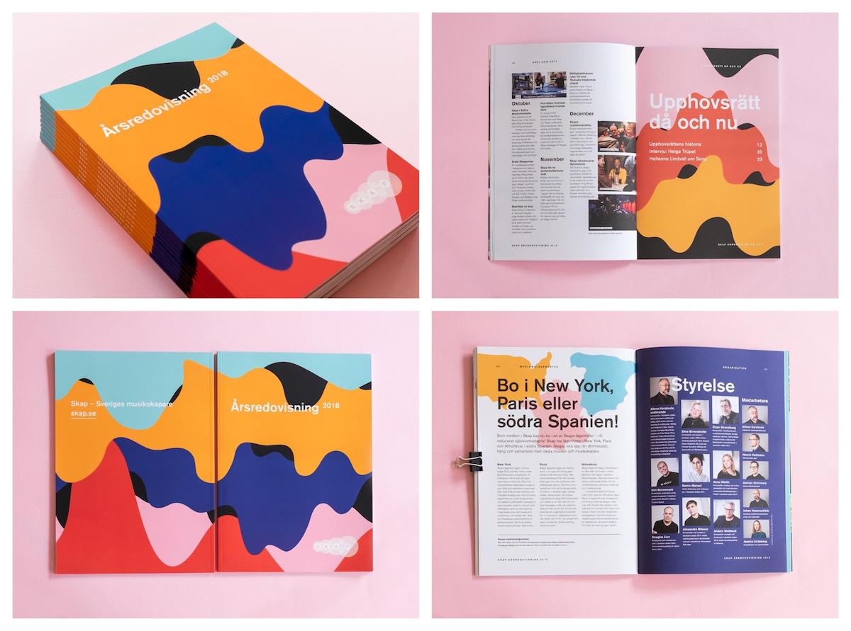
In the annual report example below, the designer used both muted colors and flowing shapes across each page. Both of these graphic design trends play well off each other:

A designer can use flowing shapes and lines to make their graphics seem down to earth, creative, and authentic.
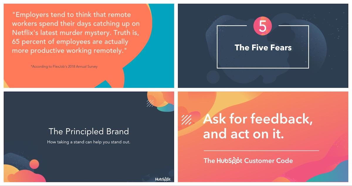
For example, HubSpot, a big company with over a thousand employees, has been using a lot of flowing shapes lately:

This plays well off of other big enterprise companies that seem to use more professional and rigid graphics.
The design assets for their conference, Inbound19, was basically taken over by these flowing shapes too:

Plus, I’m guessing after the tens of thousands of marketers who attended the conference saw the beauty of these flowing shapes, their popularity is going to continue to grow.
Flowing lines can be used to add some simple texture to your graphics like Bounteous did below:

As you can see in the example above, heavy and geometric fonts pair extremely well with these flowing lines and shapes because of the contrast. Not sure what I’m talking about?
Check out the contrast between the header of this page, and the flowing pattern on the right:

The header basically jumps off of the screen. The same thing can be said about the font used example below:

The hard angles of the font stand out against the flowing shapes and really grab your attention. Even when the background color changes, the content is still very easy to read.
These flowing shapes look amazing on the high definition screens that so many of us are glued to:

Actually, that might be the biggest driving force that has brought these flowing shapes and lines to the masses.
