As you have probably realized, the past few years in graphics design have been dominated by Bold Colors, mind-bending gradients, and futuristic compositions.
But in 2020, the graphic design world is going to feel a lot more reserved, harmonious, and natural.
Well, except for the illustrations, those are going to get a lot more abstract this year.
This shift is likely a reaction to the overuse of some of the previous graphic design trends.
Design styles that were very unique just a few years ago have become just another common tactic used by massive corporations.
The biggest graphic design trends of 2020 are:
- Muted Color Palettes
- Color Gradients
- Abstract & Dreamy Illustrations
- Heavy Simple Fonts
- Flowing Lines & Shapes
- Genuine & Authentic Stock Photos
- Minimalist Landing Pages
- Better Branded Animations
Muted Color Palettes
Over the past few years, we have seen the rise of bold colors in design, as brands looked to differentiate themselves from competitors. With bright blues, electric yellows, and toxic greens appearing all over the yearly graphic design trends.
But in 2020, we are going to see designers and brands take a step back from those vivid colors towards more muted color palettes.
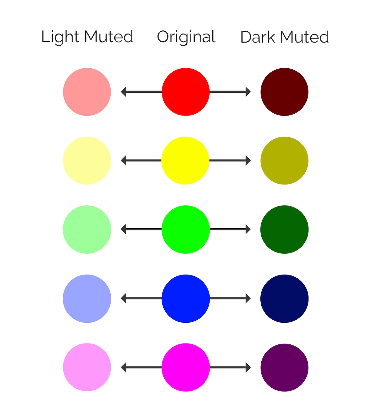
Muted colors have been slightly de-saturated with black, white or a complementary color. They are basically the opposite of vivid colors.

As you can see below, the LinkedIn Marketing team have been using these muted colors professionally lately:

I like to think of muted colors as vivid colors that have had their “edge” taken off with an infusion of black or white. The chart below is a good example of both light and dark muted colors actually.
Additionally, you can use a muted background color to make simple text or content a lot easier to read.
There’s no shortage of color in any of these graphics. The main colors just don’t dominate the graphics like some of the trendy colors of the past.
After years of loud color palettes, these muted colors can be used by brands to signal a move towards the future.
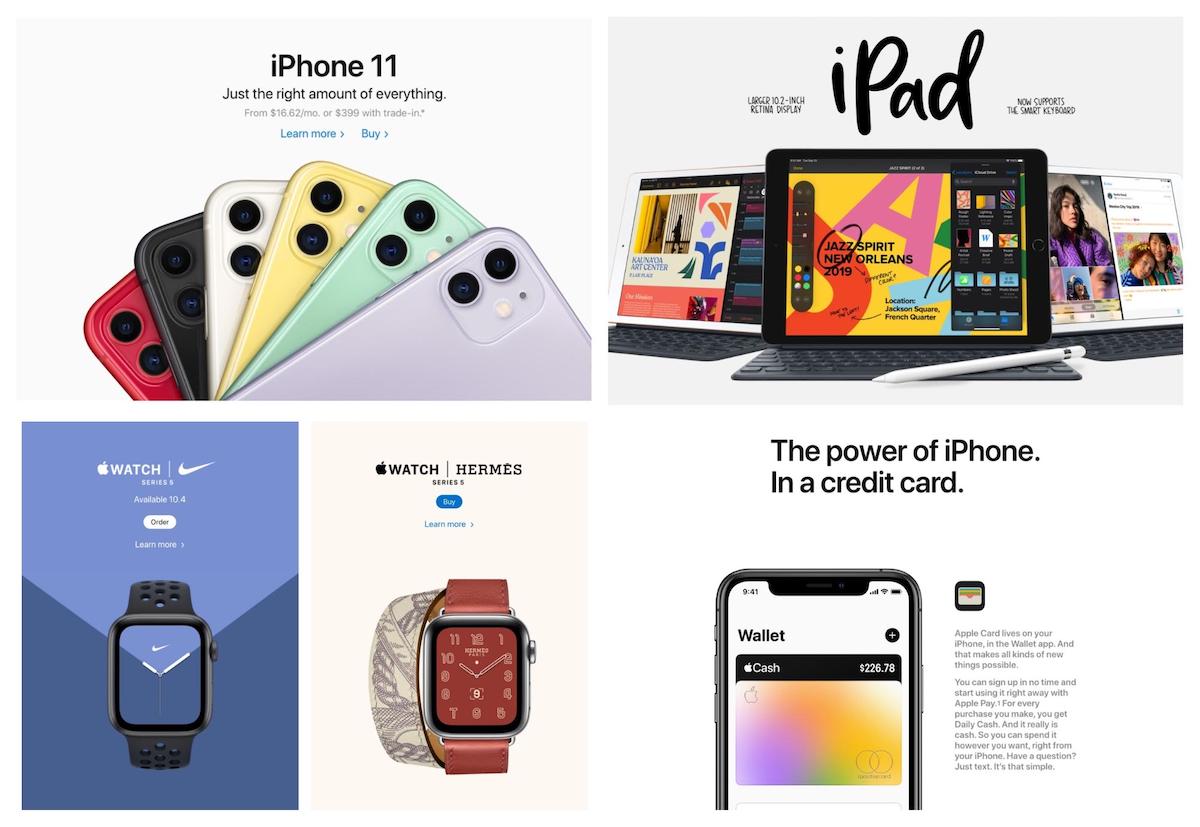
For example, the vivid colors previously used by Apple in their marketing, and even the new iPhone colors, have been replaced by more muted tones.

As you can see, these muted colors make the product feel a lot more modern and current. The Apple Card gradient, which would normally feature loud or bright colors like with Apple Music, actually uses muted colors too!

And like last year, once Apple starts doing something, the design world follows.

